Blog Entry
The State of the Blog
As an artist, but equally as a programmer, this project has meant a lot to me. I have been thinking about it ever since it was introduced to me last year. A few mockups were made during the summer, but none came to fruition.
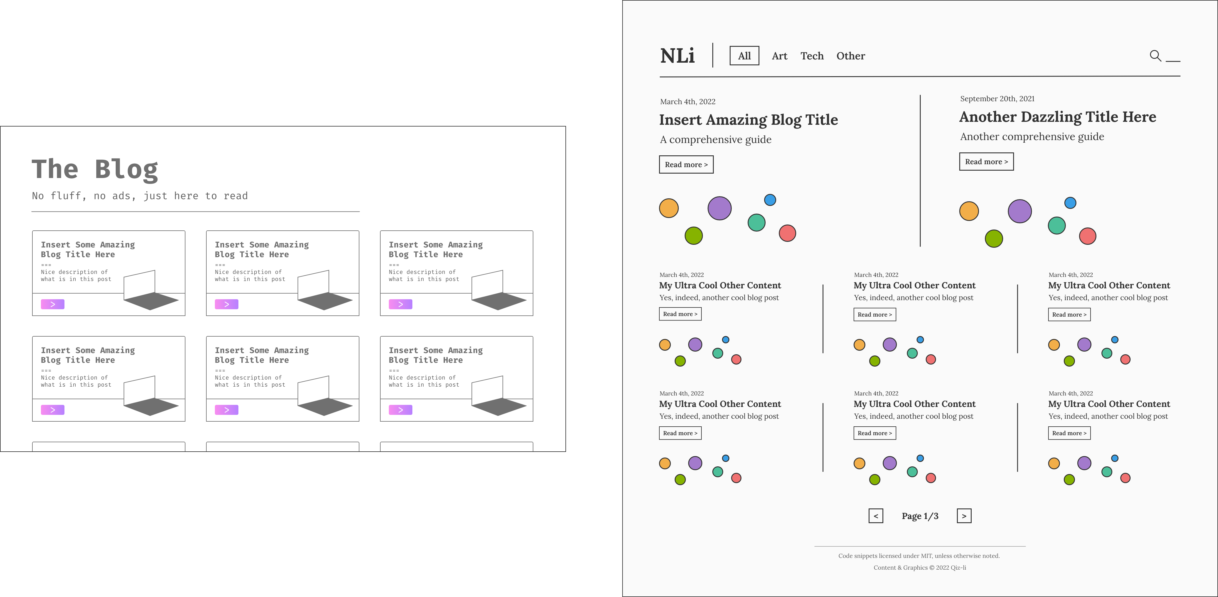
Previous blog designs. From left to right, Version #1 and Version #2. Own work.
Conventionally, many choose to create blogs using website builders such as wix.com. However, to allow for more creative control and to satisfy the web developer inside me, I decided to build my blog from the ground up.
87,295 lines of code later, here it is. Did it match the grand version I set out to achieve? No. But as building this blog (officially known as “NLi Does Art”) was as much a technical challenge as it was a creative one, I am more than proud of what I have today.
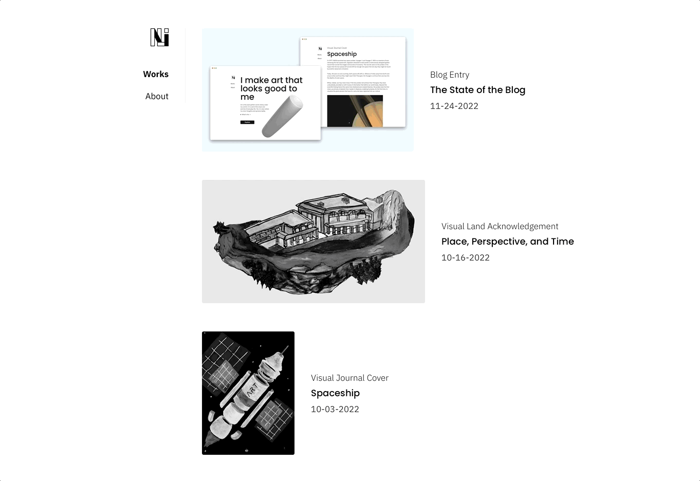
The blog as it stands today (November 2022). Own work.
Introduction
Today, the web is at the forefront of innovation. Yet, perhaps because of so, at the same time, it remains a messy place. When browsing a webpage, you never know if a paywall will suddenly pop up or if beautiful Russian women will unexpectedly start appearing in your vicinity.
In this blog, I aimed for an experience as simple as possible: one that would allow the reader to not focus on how to get rid of the successive ads but on every character and every word I have to say.
Form and content has always been closely interconnected in web design. A great user interface can enhance the delivery of information, and a poor user interface can obscure and destroy even the best content.
Many web designers, including myself, set out to create memorable and innovative websites through the creative use of colours, shapes, shades and more. However, considering that this blog is a place to showcase my artwork, I envisioned a site not with extravagant colours and design but rather a subtle backdrop that would allow what is most important to shine: my art.
With the variety of style in my artwork, the blog was never intended to be, at least directly, yet another piece of art that can potentially clash with all those inside it.
At its core, the simple black and white palette was intended to complement and not distract from the full range of colours that are and may be featured in my artworks. Yet here, also lies the first design challenge.
Contrasting Colors
It is a challenge to cohesively showcase many strikingly different art pieces together. A green drawing and a red painting might stand alone as beautiful artworks, but display them together, and it may have the unintended effect of creating Christmas.
This was especially prominent on the “Works” page. While curators have the opportunity to select and organize artworks, due to the rolling basis of the blog, I quite literally do not know what might come next. The next artwork may well clash with the palette and style of the previous one.
Ultimately, after considering a variety of methods, I chose one approach: each artwork is black and white and only reveals its full colour upon hovering over it.
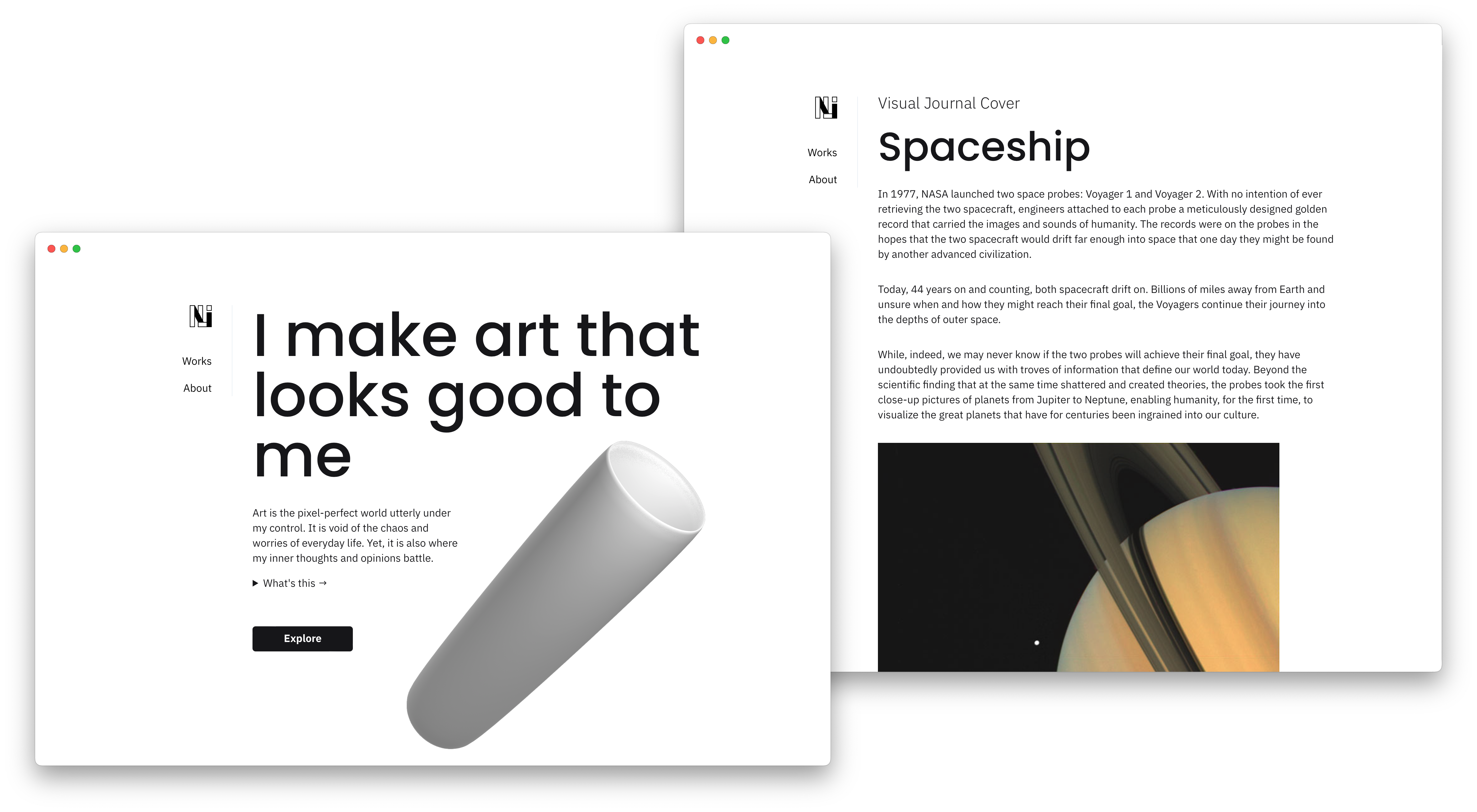
Works page, where a variety of artwork is displayed. Own work.
At first, I was reluctant to this approach. I knew it would inevitably hide the colour of the pieces and, as such, from a glance, a viewer may never see the full scope of all the artworks.
However, particularly after my friends shared some of their artwork with me, I realized the story behind an art piece is just as important as its colour. To me, an F1 car is an F1 car. But to my friend, that particular car in which Kimi Räikkönen drove through the smoke is a symbol of defiance, passion, and power.
As such, not only does the monochromatic colour scheme unite all the artworks under one common palette, but the hover effects also symbolize that an artwork remains hidden and muted until the story behind it is revealed, actively encouraging and inviting the viewer to browse beyond the surface to understand the deeper value that rests within each piece.
Future
Looking into the future, I am more than excited about the blog. I am sure the endless tweaking of fonts and margin will continue, but finally, in this semi-settled state, I hope to now start adding a lot of my previous artwork.
In my opinion, today’s web is beyond just styles. True craft is shown through snippets of micro experiences, whether that be cursor animations, page transitions, or hover effects. I hope to invite and involve the user as an integral part of the blog.
As much as I wish I am unbounded by time and technical constraints in creating this blog, there continue to be many technical challenges.
For example, while it may look functional, the underlying CSS for this blog is a mess of spaghetti code. I hope to continue working on various technical aspects of the site to improve its performance but, most importantly, optimize for mobile devices, which play an increasingly larger role in the internet today.
Ultimately, I would like to create a seamless site that is focused on every last detail, every last pixel.
This blog is inspired and built upon ronv/sidey.